

Writing the history of Mondia today doesn't just mean consulting dusty old catalogs or relying on handed-down memory; it means respectfully crossing the threshold of the Musée International d'Horlogerie (MIH). Within those silent walls, in one of the nerve centers of global watchmaking, the documentary collection donated by Paul Vermot's widow preserves the authentic soul of the manufacture at Rue Jardinière 147. These are not mere paper files: they are fragments of an existence dedicated to precision. Flipping through handwritten letters, technical notes scribbled in pencil, and industrial drawings, an obsession with perfection emerges, allowing an independent entity to challenge the giants of its era. The Mondia brand, observed through this privileged lens, ceases to be a mere graphic sign and becomes the seal of extraordinary creative independence.
The Dawn of an Identity: 1935 and the Vision of the Name

Mondia Logo – Year 1935
Our analysis journey begins in 1935. Paul Vermot, who had been involved in the manufacture since 1928, instilled an aesthetic direction in the brand that drastically broke with the static past. Many, when superficially analyzing brand histories, tend to dismiss a company's logo as a simple graphic "sign," a stylistic exercise in itself. However, those fortunate enough to study the manufacture's original documents know that the reality is quite different: what we read on the dial is the Vision of a Name.
For Vermot, that dynamic, spirited, and right-leaning cursive was not a mere aesthetic embellishment. It was, to all intents and purposes, a manufacturing specification. It represented the kinetic energy of a man who tirelessly traveled between England and the Nordic countries to position his products. In those years, La Chaux-de-Fonds was a district where many entities did "the same thing," producing anonymous components for third parties. Vermot, however, wanted his brand to "run" differently. That name on the dial was a declaration of independence: Mondia was no longer just a watch factory, but a promise of recognizable quality everywhere.
The Years of Trial: 1940 - 1949
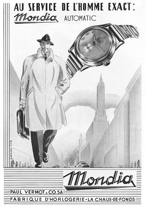
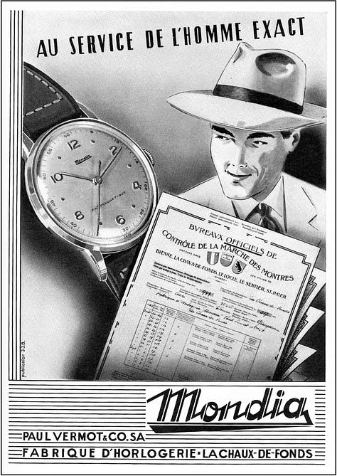
Advertising Posters, Year 1940 – 1949
During those years of war and global uncertainty, the Mondia watch shed all superfluity to become an instrument of absolute precision. Advertising campaigns of the period showcased timepieces described as "service" or "military." Steel cases became more robust, designed to withstand extreme conditions; dials featured highly legible Arabic numerals and graduated scales used to measure distances and times in professional contexts.
While the world outside trembled, within the manufacture, the expertise of Juana Jeanneret, an administrative pillar since 1922, ensured the necessary stability so that work never ceased. Paul Vermot continued to design and travel, even when borders were difficult to cross. The 1935 logo had become a symbol of resistance: the vision of a name that would not falter in the face of any storm, carrying the company towards post-war reconstruction.
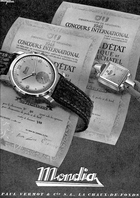
The Golden Decade: 1950-1955 and the Conquest of Manhattan
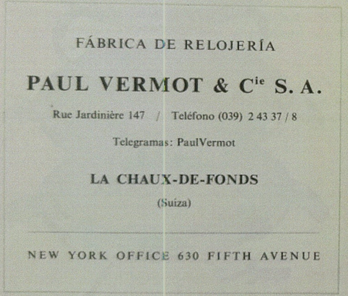
From La Chaux-de-Fonds to New York
With the end of the conflict, watchmaking once again became a matter of style, prestige, and the celebration of rediscovered success. Mondia flourished, transforming its renowned technical mastery into pure, accessible luxury. In 1951, Paul Vermot officially assumed the Presidency of the Société Anonyme, and the brand's vision underwent a monumental evolution. The dynamic cursive of its beginnings disappeared, replaced by a more solid, institutional font, surmounted by a stylized globe. The name "Mondia" now no longer just had to run, it had to embrace the world. This was the period of the factory's 50th Anniversary (1905-1955). To celebrate this milestone, Vermot took the boldest step of his career: he opened a representative office at 630 Fifth Avenue, in New York.
Mondia Logo – Year 1955
The manufacture in La Chaux-de-Fonds became a "Mid-Century" aesthetic laboratory. The watches of this period were adorned with gold (the famous 20-micron gold plating) and the dials became three-dimensional works of art, with faceted arrow indices that captured the light. It wasn't just aesthetics: the technical documents at the MIH reveal that Mondia launched innovations like the reference 2264, equipped with the AS 1485 caliber with a power reserve indicator. It was the watch for the modern businessman, for the man who frequented Manhattan clubs with the confidence of someone wearing a fragment of the best Swiss engineering on his wrist.
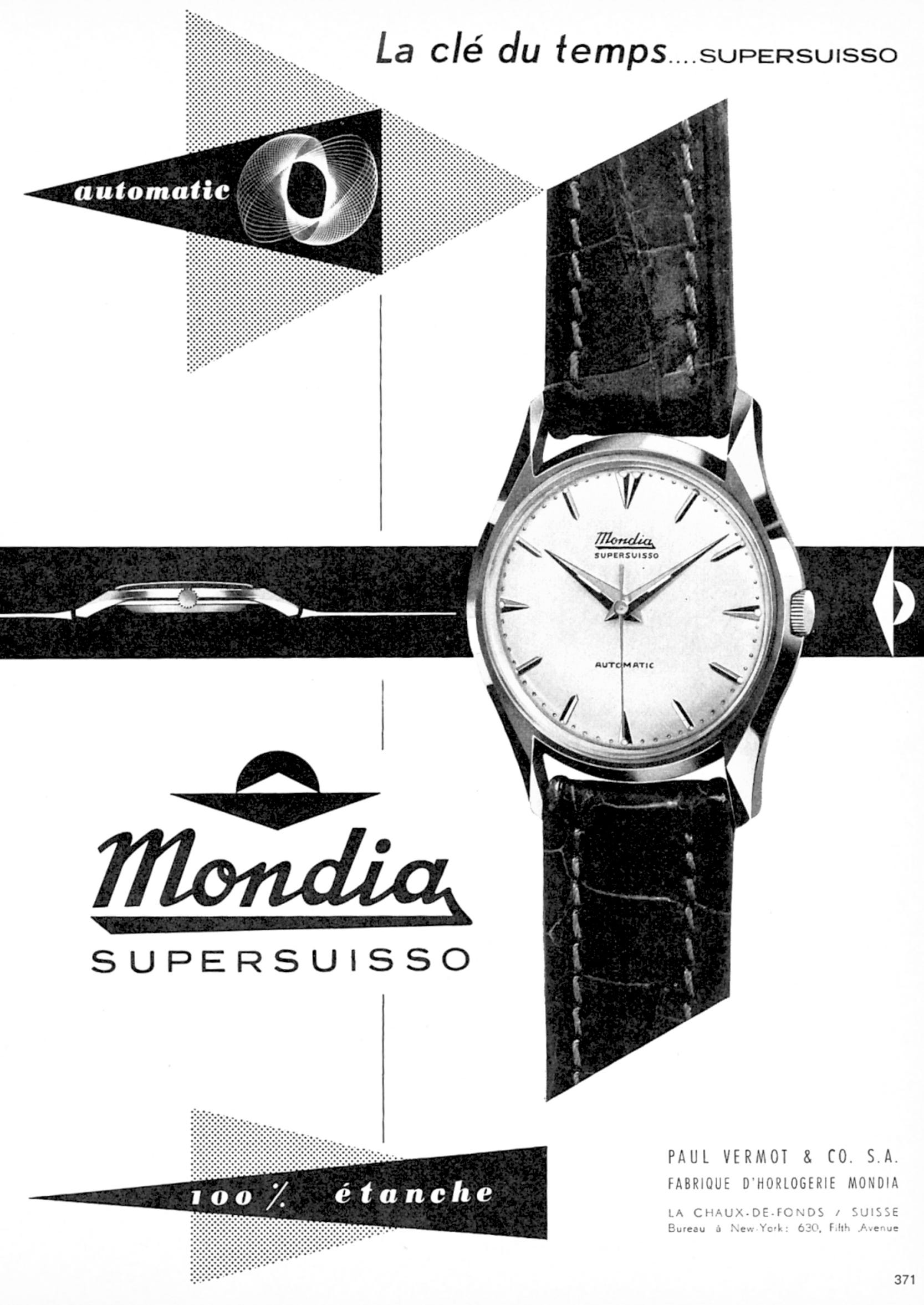
The 1958 Seal: The Monobloque Revolution and the "Supersuisso" Oath

Mondia Logo – Year 1958
Towards the end of the decade, Mondia made its most radical technical leap, paving the way for the icons of the 1960s. The 1958 logo became stark, essential, geometric. Below it, the phrase "Supersuisso" proudly began to appear.
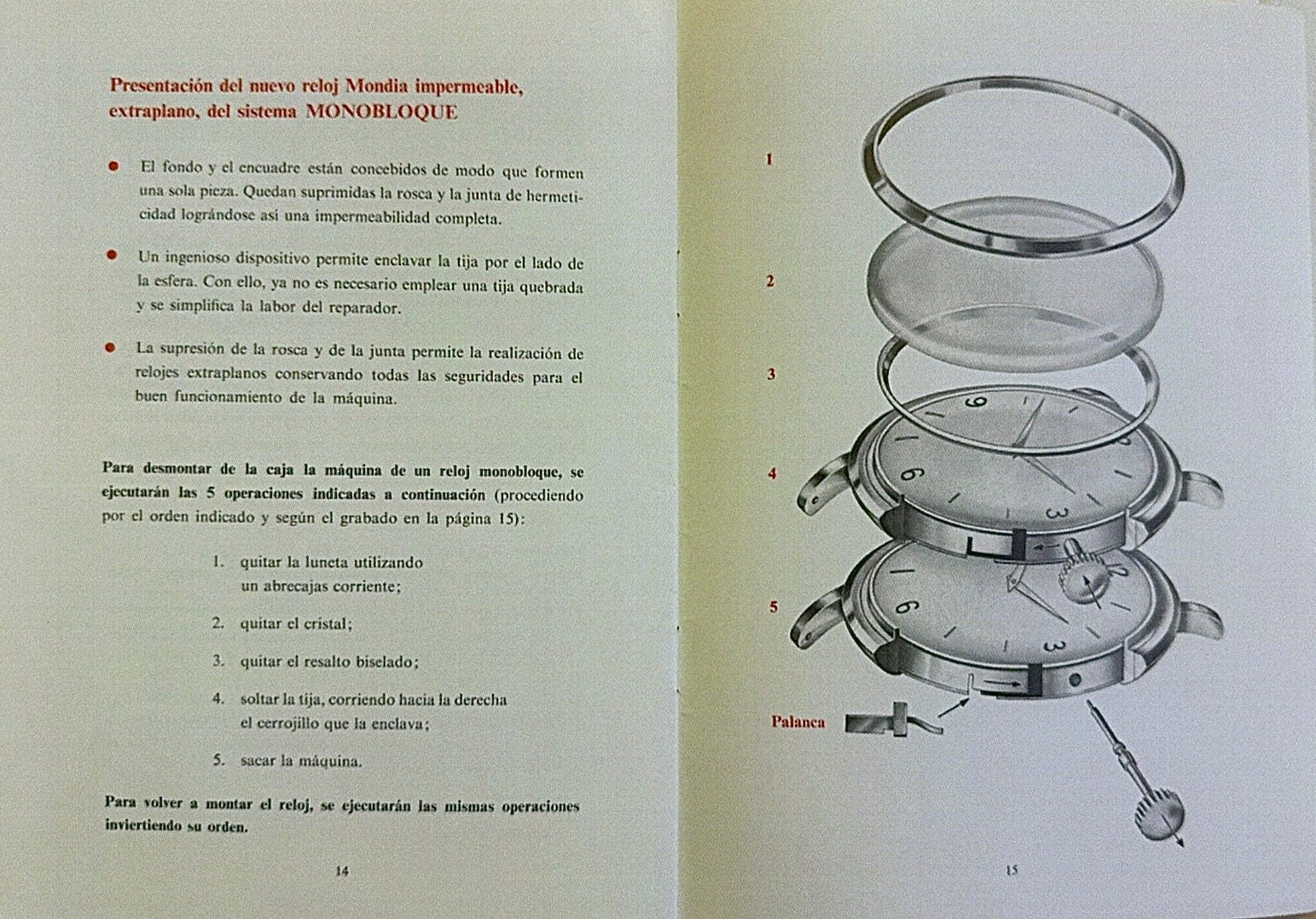
Monobloc System, caliber 5 A.S. 1012 with 17 jewels
This word was not just an advertising gimmick, but a solemn commitment to quality. In the technical notes preserved at the MIH, the almost feverish excitement for the launch of the Monobloque system emerges. Vermot introduced an engineering solution to the market that eliminated the vulnerability of traditional casebacks. The case became a single piece, definitively protected from water infiltration and dust.
This innovation allowed for extraordinary calibers like the AS 1310, reducing the total height of the watch to just 6.9 mm. Period advertising hailed it as a "Cutting-Edge Achievement": Mondia was no longer just following the market, it was leading it. This obsession with thickness reduction, combined with the robustness guaranteed by Glucydur balances and Incabloc springs, marked Mondia's definitive entry into the elite of research-driven watchmaking.
A Legacy That Still Speaks to Us
Advertising Poster – Year 1958
Analyzing these first twenty years through the documents of the Paul Vermot Collection means understanding that Mondia was never a "watch factory" in the common sense of the term. It was a vision shared by Paul and Juana, nurtured by the work of over a hundred employees who firmly believed in creative independence. The donation made by Vermot's widow to the MIH is not just an act of generosity, but a legacy of truth: every screw, every logo, and every patent cited is tangible proof of a real and proud history.
We started from a small workshop in Rue Jardinière to reach the skyscrapers of New York. We saw the brand transform from a dreamy cursive into a global globe, and then into the geometric symbol of "Supersuisso" precision. But this, as we will see in the second part, was only the prelude to an even greater revolution.
Timeline Recap: The Mondia Identity (1905 – 1958)
- 1905: Foundation of the factory in La Chaux-de-Fonds, Rue Jardinière 147.
- 1922: Juana Jeanneret joins: administrative stability.
- 1928: Paul Vermot joins: international vision.
- 1935: Launch of the first dynamic logo and the Mondia brand.
- 1951: Vermot and Jeanneret take the helm of the S.A.
- 1955: 50th Anniversary: Globe Logo and landing on Fifth Avenue, NY.
- 1958: Geometric logo and debut of "Monobloque" technology and the "Supersuisso" seal.
Recommend Mondia Swiss to enthusiasts like you — Mondia Swiss is the place for those who love time and watches. Here, enthusiasts and curious minds can discover stories, details, and inspirations, and share their passion for watchmaking. Join us and bring your passionate friends too: let's explore the world of Mondia together.
🇬🇧 Inside the Time: The Soul in Time between Rue Jardinière and Fifth Avenue
🇬🇧 Inside the Time: The Evolution of Identity (Part 2: 1960 - 2025)